Jeanne
Bramkamp
MENU
Français
English
Case study
🐘
Nantes Métropole
“in my pocket”
Mobile App Dedicated to Urban Services in the Nantes Metropolis
September 2022 – February 2023
Client
Brief
Role
Structure
Nantes Métropole
Eco-designed redesign of the urban services
UX/UI Designer
Student project in partnership - UX/UI Bachelor -L’École de design Nantes Atlantique
4 designers + project team from the Métropole
Public administration, urban services
UX/UI Fundamentals
Service Design
UX Audit
Benchmarking
UX Research
Design Sprint
Wireframing
Prototyping
UI Design
User Testing
Soft Skills & Collaboration
Communication
Agile Methodology
Project Management
Teamwork
Toolset
Figma
Notion
Maze
01
Project
Presentation
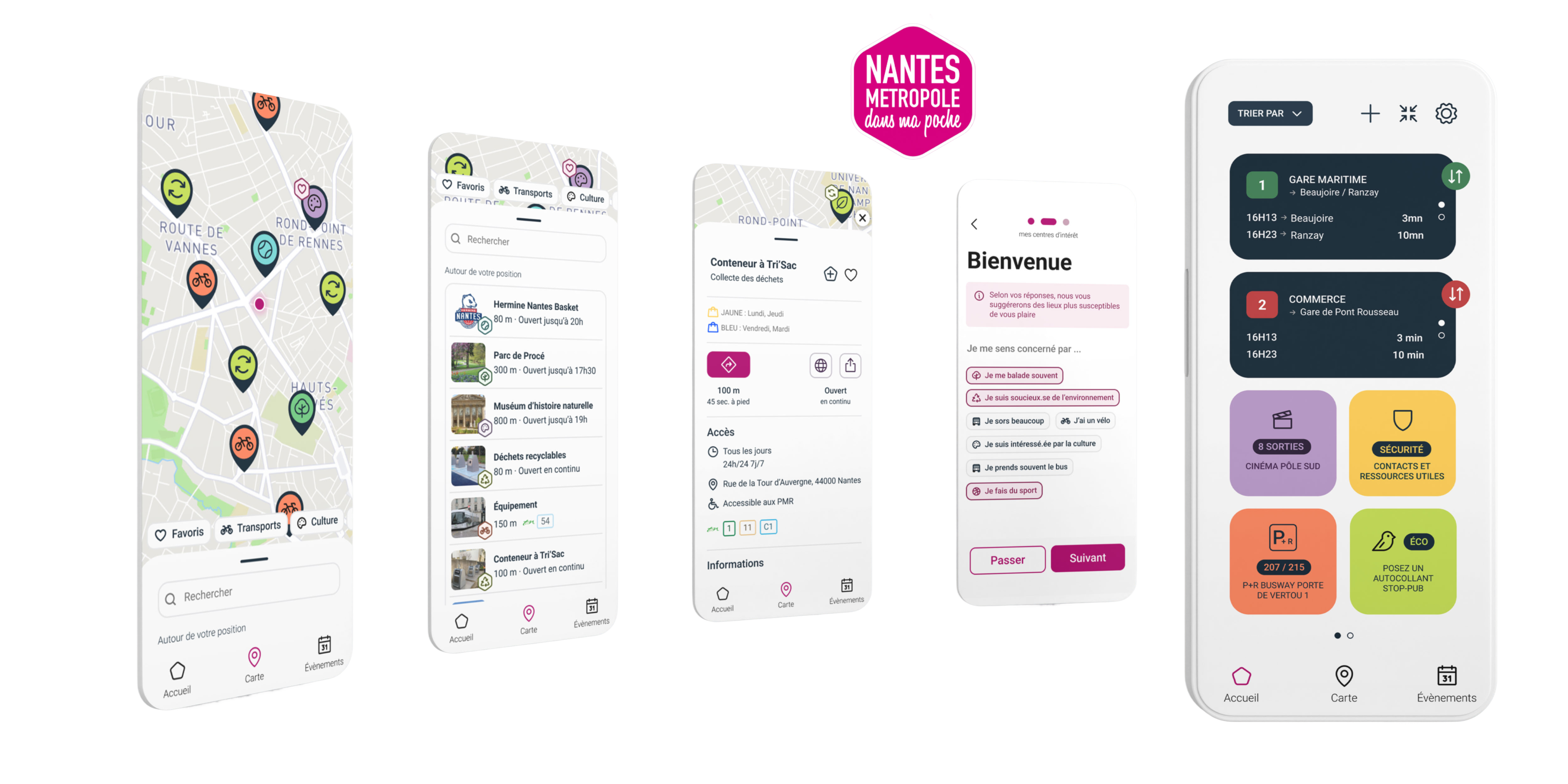
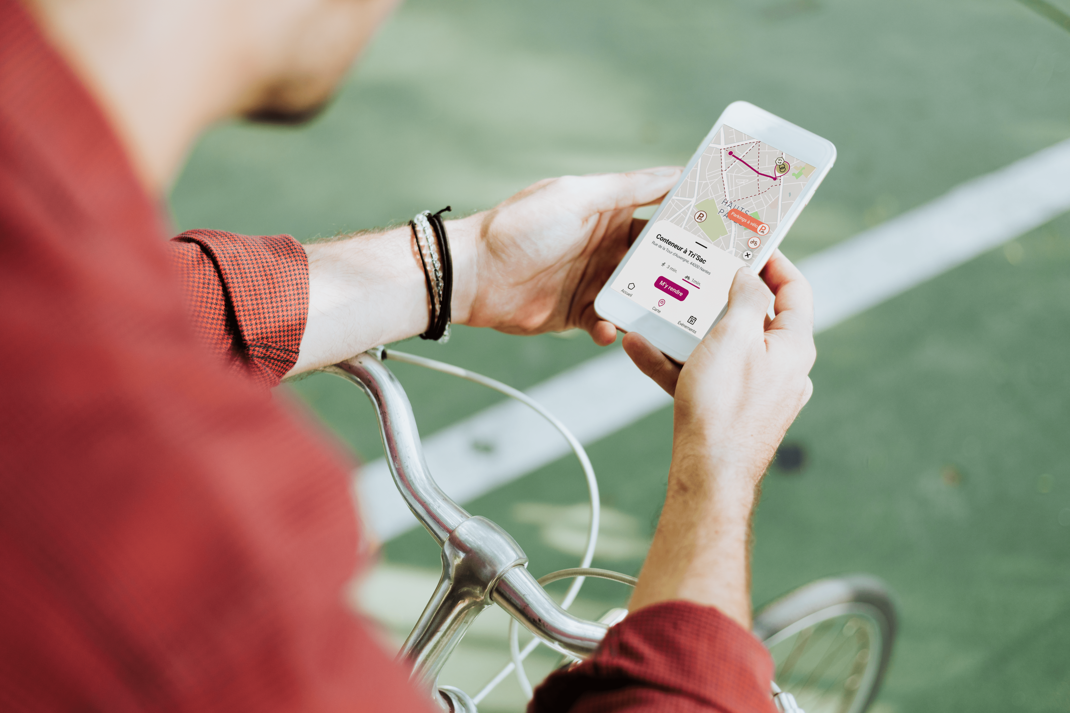
“Nantes Métropole dans ma poche” is a customizable app designed to centralize public services related to urban life: alerts, geolocated information, and real-time services. Each user can activate the services that interest them (school cafeteria, traffic, waste sorting, etc.).
By 2024, the Métropole wanted a new version of the app with the following goals:
🌱
Facilitate a more eco-friendly daily life
🧘
Promote well-being and health
🎯
Expand the target audience to young people and metro area residents
✨
Design an interface that is accessible, inclusive, and responsible
With this challenge, we (as third-year UX/UI Bachelor students at L’École de design Nantes Atlantique) were tasked to propose a full redesign of the app within an eco-design logic.
Overview
01
Project Presentation
02
Problem &
Objectives
How can the app encourage citizens to adopt an eco-friendly approach and get involved in their neighbourhood?
Our proposal focused on three pillars: accessibility, ergonomics and promotion of local initiatives, incorporating new features that are useful on a daily basis.
03
DesignMethodology
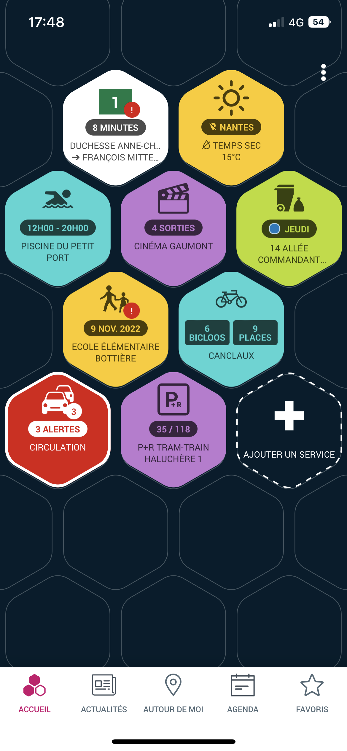
With my team, I started with an audit of the existing app, using the PCR method:
3a
Audit
Problem
Identifying user frustrations
Consequence
Analyzing the effects of those frustrations
Recommendation
Proposing improvement paths
We identified 44 UX issues, categorized by type (navigation, hierarchy, content, accessibility, etc.).
Major, non-blocking
Visual identity
🎯 Problem:
Some different services are the same colour.
💣 Consequence:
The user gets the impression that these services belong to the same category.
✅ Recommandation:
Assign a different colour to each service or group similar services together under the same colour.
Long term
Page ergonomics
Visual identity
🎯 Problem:
The current format limits the display of information. Some cells remain empty on the sides.
💣 Consequence:
Important sentences are truncated and display space is lost.
✅ Recommendation:
- Redesign the tiles (adaptive size, shapes, prioritisation according to favourites).
- Extend the visual identity of the tiles to other elements of the interface.
- Offer a widget for quick and easy access to key information.
Major, blocking
Page ergonomics
🎯 Problem:
The burger menu, which is not very visible in the top right-hand corner, contains information that is essential for using the app.
💣 Consequence:
Users may miss key features such as alerts, emergency numbers, or home screen customisation.
✅ Recommendation:
- Make the burger menu more visible.
- Add visual cues to organise the home page intuitively.
- Highlight key information in the menu if necessary for direct access. Include a temporary informational tooltip.
Version antérieure
de l’application
3b
Benchmark
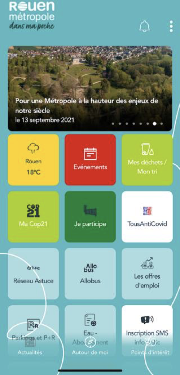
This diagnosis was supplemented by a competitive analysis of similar applications (smart city monitoring and map navigation), which enabled us to identify best practices and enrich our thinking.
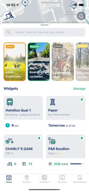
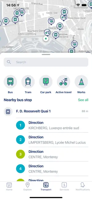

CityApp - VDL (Luxembourg)
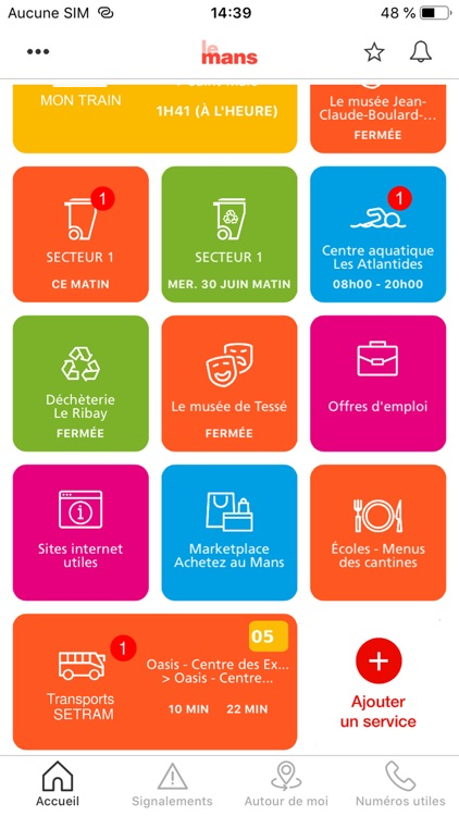
Le Mans en Poche
3c
Personas & Journey Mapping
Based on our research and information provided by the city, we created several personas to represent the main user profiles. These profiles guided our design choices from the outset.

Joséphine
25 years old
📱 New occasional user of the app
📍Recently moved to Nantes
🧑🎓 Recent graduate
🌱 Environmentally conscious
🚲 Often rides a bicycle
🎯 Objectives:
- Know the collection days in your new neighbourhood.
- Understand the colour coding of bins so you can sort your waste properly.
- Quickly find the nearest recycling point for each type of waste.
- Optimise your cycling routes so you can find your way around easily and save time.
❌ Obstacles/frustrations:
- New neighbourhood she doesn't know well, lack of landmarks.
- No travel card yet, so she relies solely on her bicycle.
- Would like to adopt eco-friendly habits more easily, without spending too much time searching everywhere.
💡 What she expects from the app:
Simple, quick help to get organised in a new city, save time and do the right thing for the environment without any hassle.
3d
Journey Mapping
Journey maps were then created to visualise user journeys and identify friction points that needed to be resolved.
3e
Agile Methods & Prioritisation (ROI)
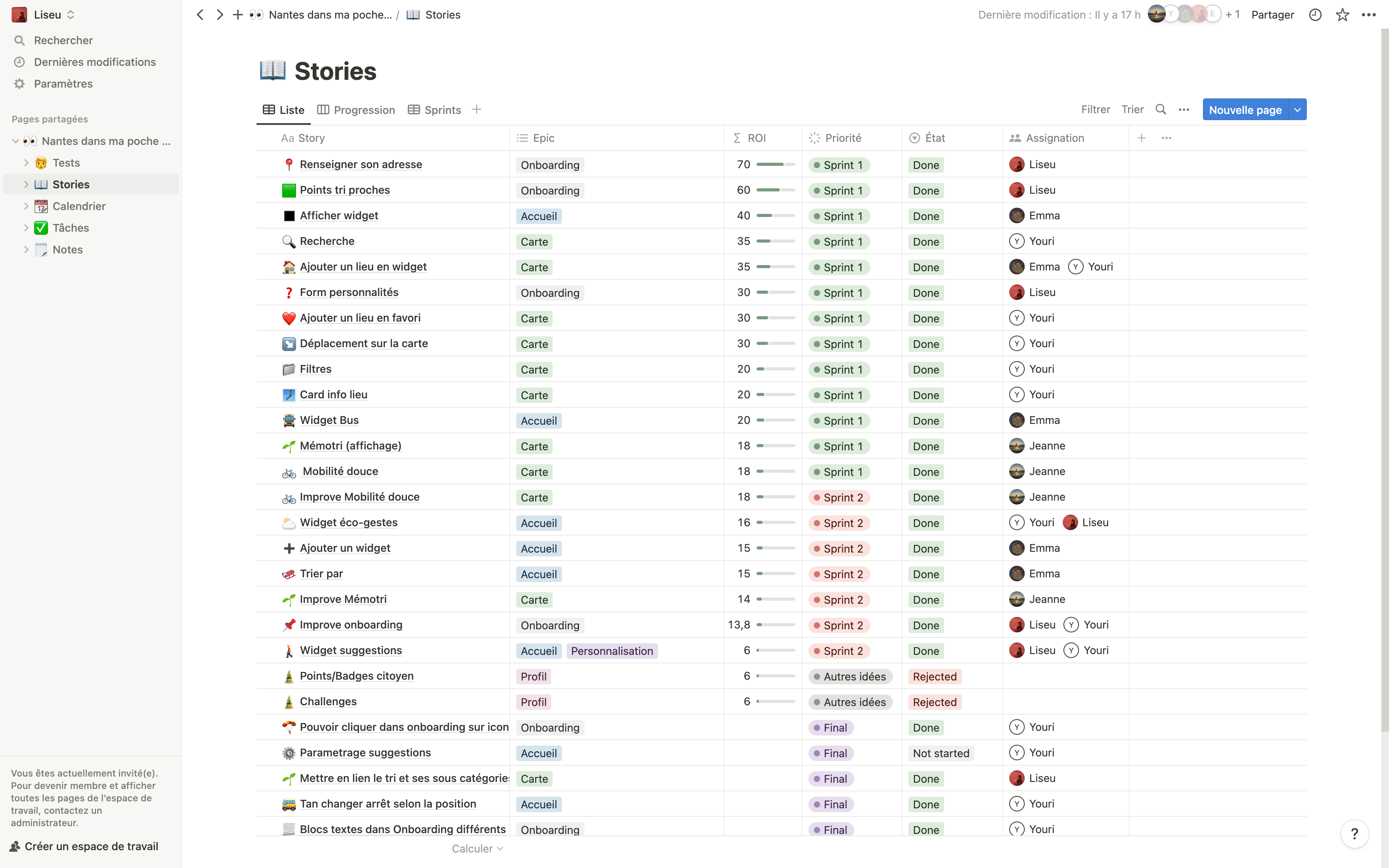
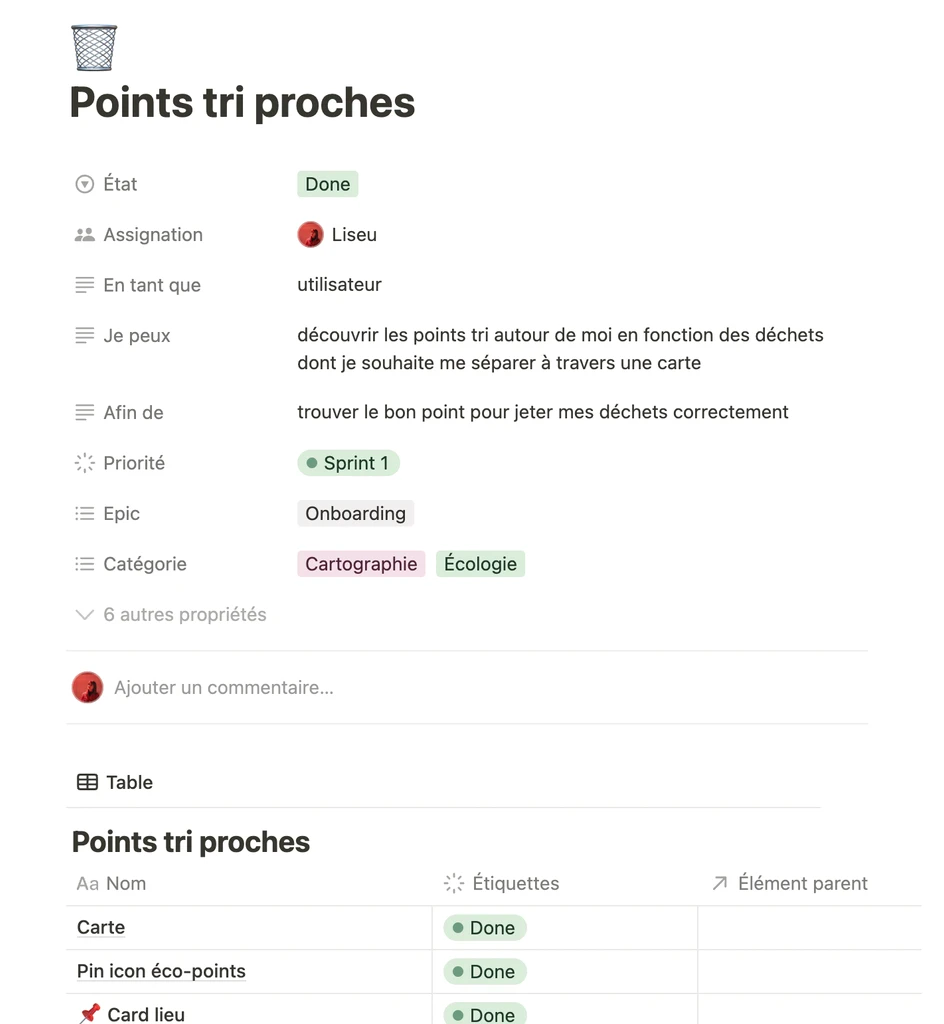
The project was structured using the Scrum method, with short sprints spread over three months. We used Notion to assign tasks, track progress and collaborate effectively as a team.
To prioritise the features to be implemented, we used the ROI (Return on Investment) approach:
ROI = Business Value / Cost
Business Value : added value for the user
Cost : design time + necessary resources
This enabled us to make rational choices and focus our efforts on high-impact features.
3f
Wireframes & Mock-ups
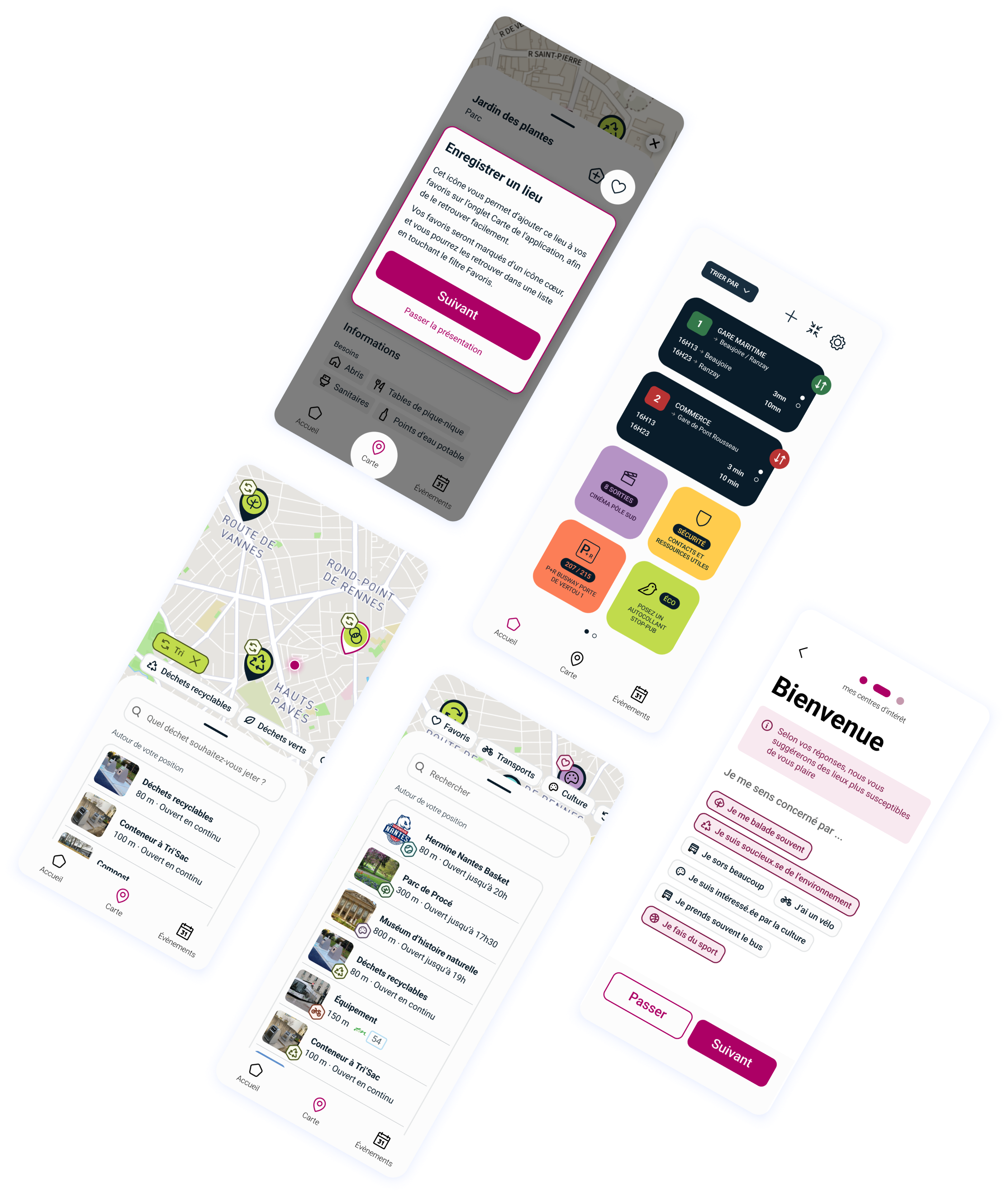
We have restructured the navigation to make it more intuitive and fluid, based on users' habits and expectations.
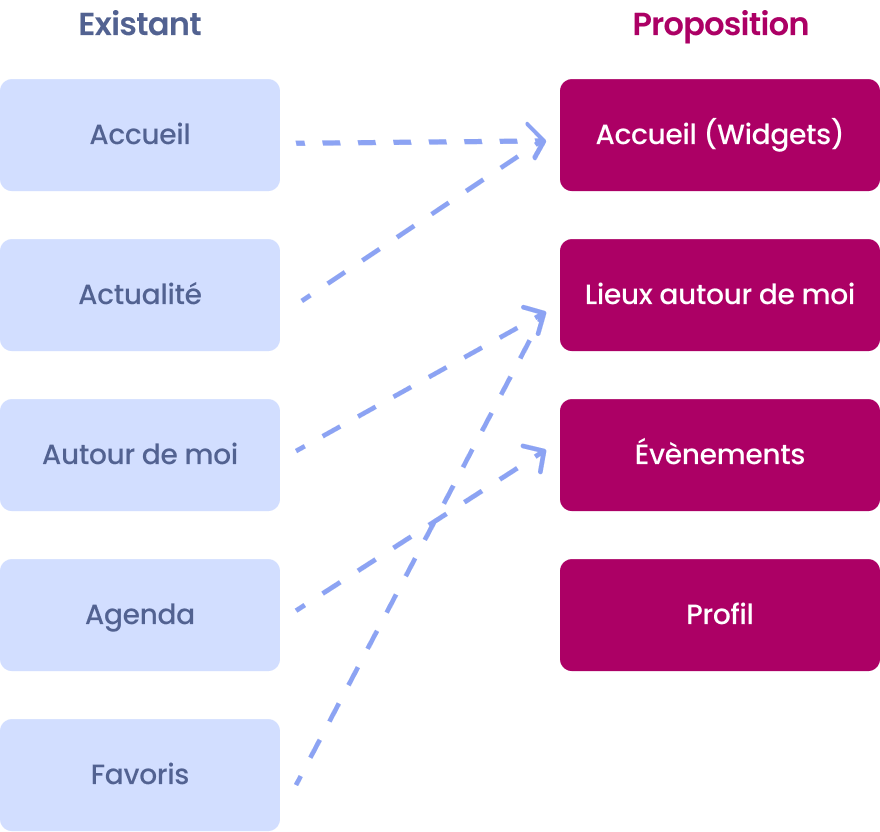
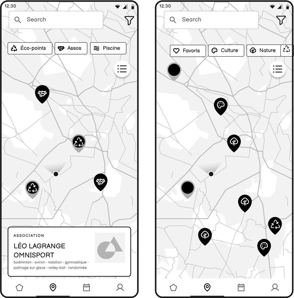
In particular, I initiated the merger of the ‘Mémotri’ and ‘Waste’ sections, enabling a clearer and more consistent approach to selective sorting.
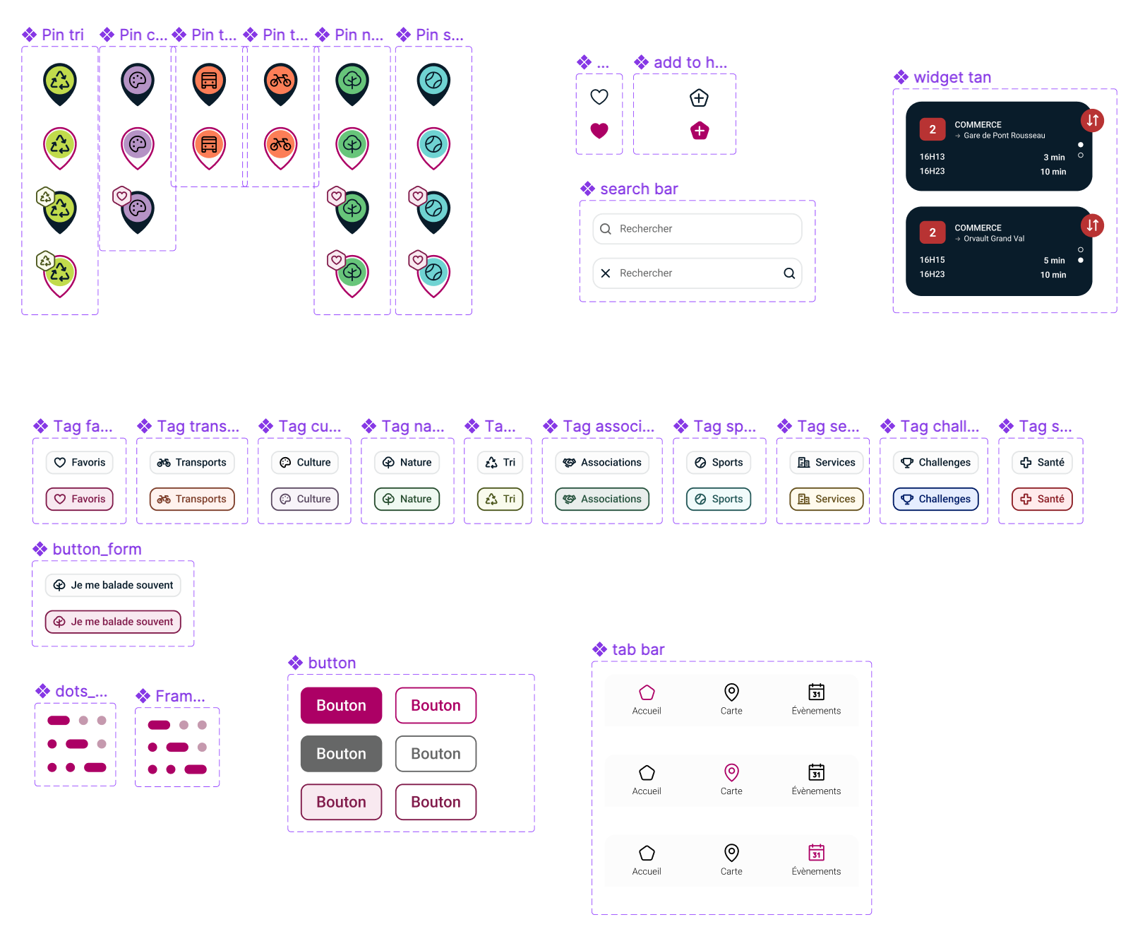
All the mock-ups, prototypes and the UI charter were then created on Figma, in line with the city's identity.

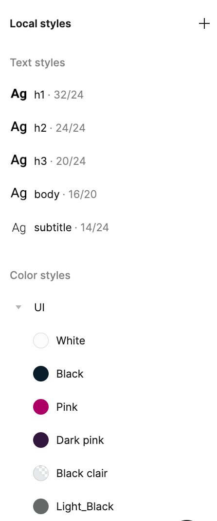


Fonts
Components
Colours
04
User Testing
User tests were conducted to validate our assumptions, refine the experience, and identify necessary adjustments.
4a
Objectives
🌱
Identify barriers to understanding or interaction
🧘
Verify adherence to the proposed features and the effectiveness of the eco-responsible approach.
🎯
Test the intuitiveness of navigation and the readability of content.
✨
Ensure that the application is accessible to a variety of profiles (age, digital literacy).
4b
Method
We conducted around ten qualitative tests using guerrilla methods. The protocol included:
Detailed interview guide
Persona sheets to contextualize use
Authorisation to take photographs/videos
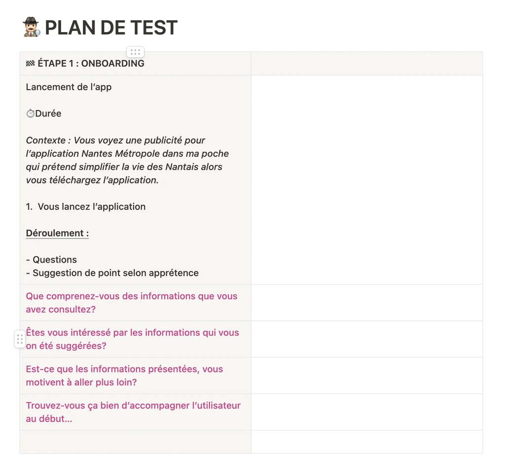
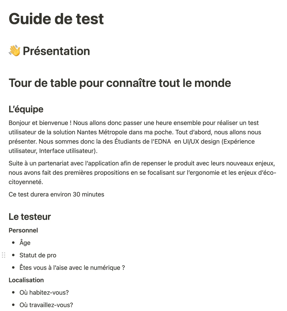
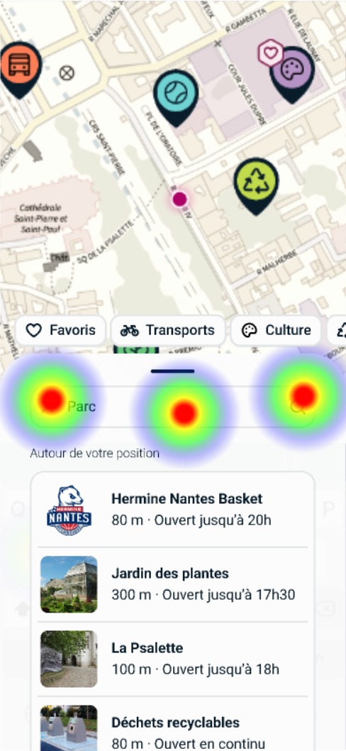
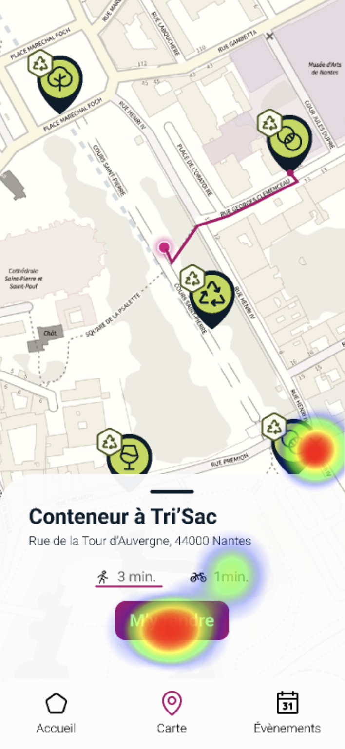
The tests were conducted in pairs using the Maze tool, with observation of verbal and non-verbal language.
The protocol included pre/post-test questions, usage scenarios and immediate feedback.
4c
Tested Journey
The prototype was structured around two key moments. These scenarios enabled us to validate the effectiveness of the new features while measuring their impact on raising awareness of eco-citizenship.
🌿
Personalised and eco-friendly onboarding
An interactive journey accessible to all, with targeted questions to activate customised widgets and recommend places based on personal tastes. These include modules dedicated to eco-responsibility (eco-friendly actions, sustainable local activities, neighbourhood news).
🚲
Navigation and soft mobility
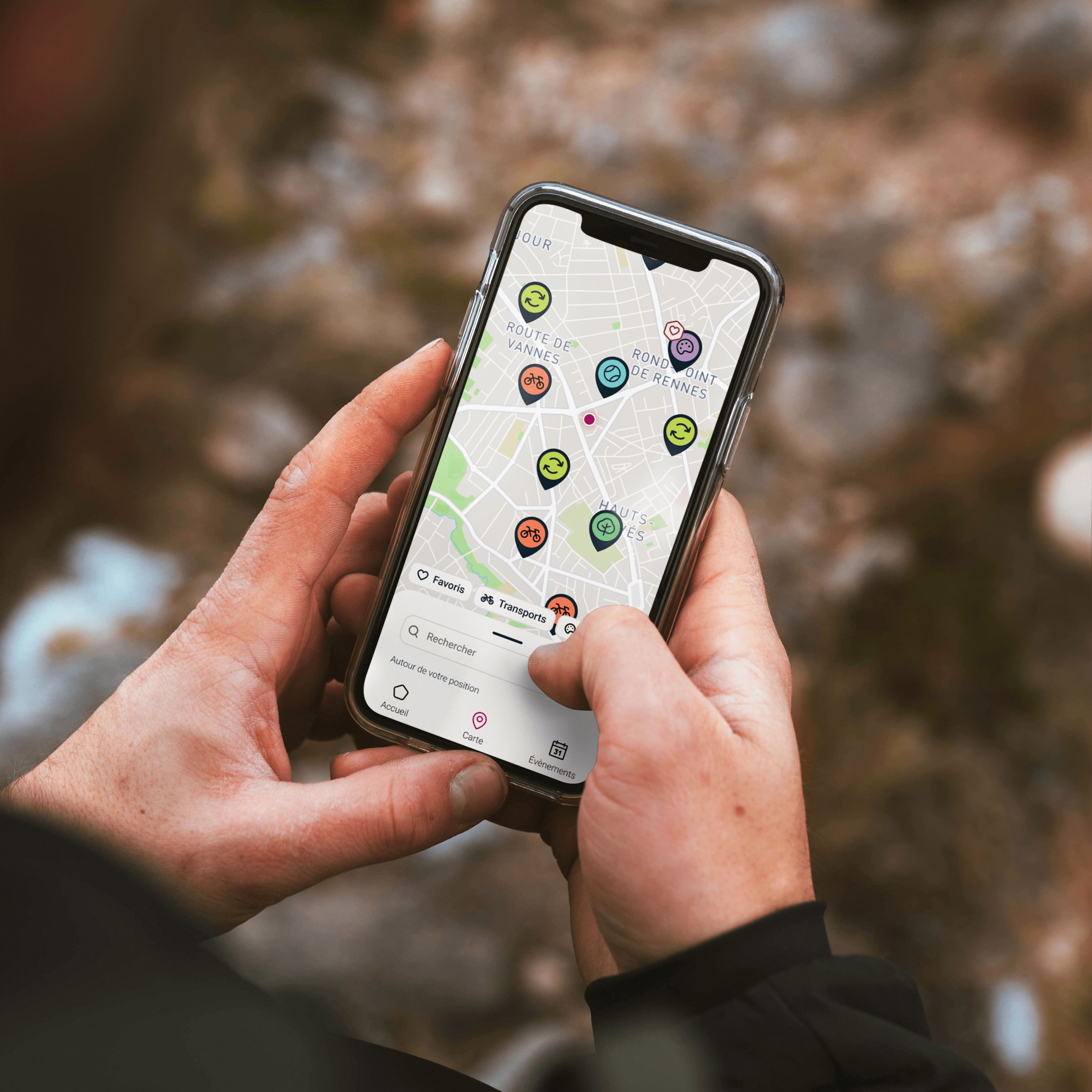
Navigation is via an interactive map that allows users to search for recycling points, generate cycle routes and add favourites. The interface is optimised for soft mobility (walking, cycling).
4d
Results & Summary
User feedback was compiled in a summary document highlighting:
- Strengths to be retained
- Improvements to be prioritised for Sprint 2
- Concrete ideas for optimisation
WHAT WAS APPRECIATED
Personalised onboarding
The tag/filter system
Nearby locations on the map
The informative ‘locations’ pages: sorting waste
The ‘clean, clear and pleasant’ graphic design
WHAT NEEDS TO BE REVIEWED
Distinguish between adding to favourites and to the home page
Clarify the context of onboarding
Revise the hierarchy between main and subcategories
Improvements to the cycle route system
Clarify the scroll down to discover the ‘locations’ pages
05
Team Review
his collaboration with Nantes Métropole allowed me to work on a real client project, structure team organisation effectively (using Notion and Scrum), and become familiar with guerrilla-style user testing.
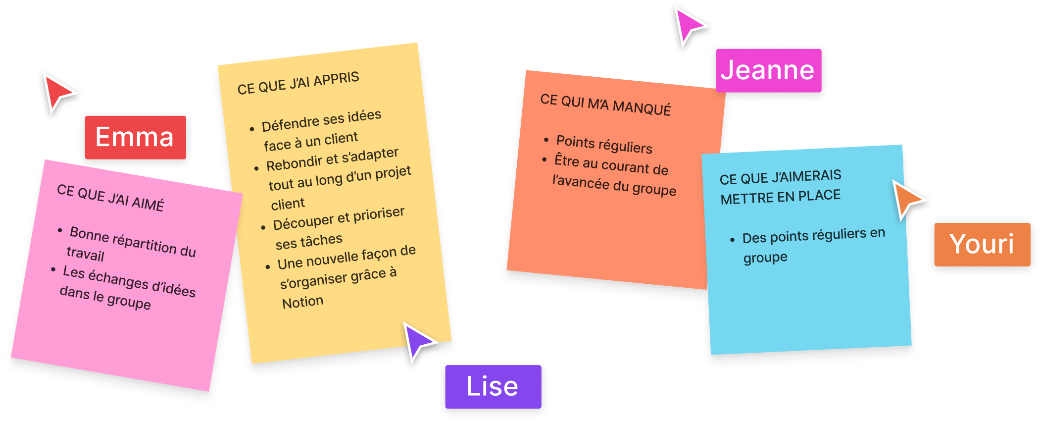
We concluded with the “4L” method (Liked, Learned, Lacked, Longed) to share our feelings, identify what we’ve learned, and areas for improvement — a helpful process for growing together.
06
Skills developed
This project was a real opportunity for me to apply a complete UX approach in a concrete context.
I learned to design sustainable digital services, test my ideas in the field, and collaborate effectively in an agile team.
📣 Currently looking for an ERASMUS+ internship
👉 Interested in
I’d be delighted to exchange!
Contact me
Case study
Français
English
🐘
Nantes Métropole
“in my pocket”
Mobile App Dedicated to Urban Services in the Nantes Metropolis
September 2022 – February 2023
Client
Brief
Role
Structure
Team
Sector
Nantes Métropole
Eco-designed redesign of the urban services mobile application to make it more intuitive, accessible, and oriented toward eco-citizenship
UX/UI Designer
Student project in partnership - UX/UI Bachelor -L’École de design Nantes Atlantique
4 designers + project team from the Métropole
Public administration, urban services
UX/UI Fundamentals
Service Design
UX Audit
Benchmarking
UX Research
Design Sprint
Wireframing
Prototyping
UI Design
User Testing
Soft Skills & Collaboration
Communication
Agile Methodology
Project Management
Teamwork
Toolset
Figma
Notion
Maze
01
Project Presentation
“Nantes Métropole dans ma poche” is a customizable app designed to centralize public services related to urban life: alerts, geolocated information, and real-time services. Each user can activate the services that interest them (school cafeteria, traffic, waste sorting, etc.).

By 2024, the Métropole wanted a new version of the app with the following goals:
🌱
Facilitate a more eco-friendly daily life
🧘
Promote well-being and health
🎯
Expand the target audience to young people and metro area residents
✨
Design an interface that is accessible, inclusive, and responsible
With this challenge, we (as third-year UX/UI Bachelor students at L’École de design Nantes Atlantique) were tasked to propose a full redesign of the app within an eco-design logic.
Overview
01
Project Presentation
02
Problem & Objectives
How can the app encourage citizens to adopt an eco-friendly approach and get involved in their neighbourhood?
Our proposal focused on three pillars: accessibility, ergonomics and promotion of local initiatives, incorporating new features that are useful on a daily basis.
03
Design Methodology
With my team, I started with an audit of the existing app, using the PCR method:
3a
Audit
Problem
Identifying user frustrations
Consequence
Analyzing the effects of those frustrations
Recommendation
Proposing improvement paths
We identified 44 UX issues, categorized by type (navigation, hierarchy, content, accessibility, etc.).

Previous version
of the application
Major, non-blocking
Visual identity
🎯 Problem:
Some different services are the same colour.
💣 Consequence:
The user gets the impression that these services belong to the same category.
✅ Recommandation:
Assign a different colour to each service or group similar services together under the same colour.
Long term
Page ergonomics
Visual identity
🎯 Problem:
The current format limits the display of information. Some cells remain empty on the sides.
💣 Consequence:
Important sentences are truncated and display space is lost.
✅ Recommendation:
- Redesign the tiles (adaptive size, shapes, prioritisation according to favourites).
- Extend the visual identity of the tiles to other elements of the interface.
- Offer a widget for quick and easy access to key information.
Major, blocking
Page ergonomics
🎯 Problem:
The burger menu, which is not very visible in the top right-hand corner, contains information that is essential for using the app.
💣 Consequence:
Users may miss key features such as alerts, emergency numbers, or home screen customisation.
✅ Recommendation:
- Make the burger menu more visible.
- Add visual cues to organise the home page intuitively.
- Highlight key information in the menu if necessary for direct access. Include a temporary informational tooltip.
3b
Benchmark
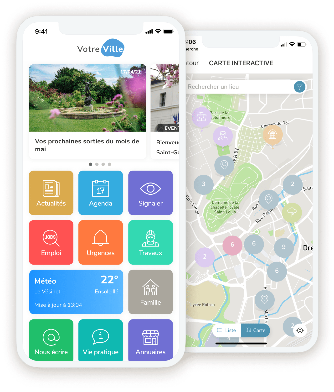
This diagnosis was supplemented by a competitive analysis of similar applications (smart city monitoring and map navigation), which enabled us to identify best practices and enrich our thinking.


CityApp - VDL (Luxembourg)


Le Mans en Poche
Rouen métropole
dans ma poche
3c
Personas & Journey Mapping
Based on our research and information provided by the city, we created several personas to represent the main user profiles. These profiles guided our design choices from the outset.

Joséphine
25 years old
📍Recently moved to Nantes
🧑🎓 Recent graduate
🌱 Environmentally conscious
🚲 Often rides a bicycle
📱 New occasional user of the app
🎯 Objectives:
- Know the collection days in your new neighbourhood.
- Understand the colour coding of bins so you can sort your waste properly.
- Quickly find the nearest recycling point for each type of waste.
- Optimise your cycling routes so you can find your way around easily and save time.
❌ Obstacles/frustrations:
- New neighbourhood she doesn't know well, lack of landmarks.
- No travel card yet, so she relies solely on her bicycle.
- Would like to adopt eco-friendly habits more easily, without spending too much time searching everywhere.
💡 What she expects from the app:
Simple, quick help to get organised in a new city, save time and do the right thing for the environment without any hassle.
3d
Journey Mapping
Journey maps were then created to visualise user journeys and identify friction points that needed to be resolved.
3e
Agile Methods & Prioritisation (ROI)
The project was structured using the Scrum method, with short sprints spread over three months. We used Notion to assign tasks, track progress and collaborate effectively as a team.
To prioritise the features to be implemented, we used the ROI (Return on Investment) approach:
ROI = Business Value / Cost
Business Value : added value for the user
Cost : design time + necessary resources
This enabled us to make rational choices and focus our efforts on high-impact features.


3f
Wireframes & Mock-ups
We have restructured the navigation to make it more intuitive and fluid, based on users' habits and expectations.


In particular, I initiated the merger of the ‘Mémotri’ and ‘Waste’ sections, enabling a clearer and more consistent approach to selective sorting.
All the mock-ups, prototypes and the UI charter were then created on Figma, in line with the city's identity.


Fonts
Components
Colours

04
User Testing
User tests were conducted to validate our assumptions, refine the experience, and identify necessary adjustments.
4a
Objectives
🌱
Identify barriers to understanding or interaction
🧘
Verify adherence to the proposed features and the effectiveness of the eco-responsible approach.
🎯
Test the intuitiveness of navigation and the readability of content.
✨
Ensure that the application is accessible to a variety of profiles (age, digital literacy).
4b
Method
We conducted around ten qualitative tests using guerrilla methods. The protocol included:


Detailed interview guide
Persona sheets to contextualize use
Authorisation to take photographs/videos
Nb.
participants
Aisancenumérique
Lieu de vie
Lieu de travail
A déjà utilisé Nantes Métropole dans ma poche
Participant 1
Participant 2
Participant 3
Participant 4
Participant 5
Participant 6
Participant 7
Participant 8
Participant 9
Élevé
Élevé
Moyen
Faible
Moyen
Élevé
Élevé
Élevé
Élevé
Nantes
Paris
Nantes
Métropole
Métropole
Nantes
Nantes
Métropole
Nantes
Nantes
Paris
Rezé
Nantes
Nantes
Nantes
Nantes
Métropole
Nantes
Non
Non
Oui
Non
Non
Oui
Non
Non
Non


The tests were conducted in pairs using the Maze tool, with observation of verbal and non-verbal language.
The protocol included pre/post-test questions, usage scenarios and immediate feedback.
4c
Tested Journey
The prototype was structured around two key moments. These scenarios enabled us to validate the effectiveness of the new features while measuring their impact on raising awareness of eco-citizenship.
🌿
Personalised and eco-friendly onboarding
An interactive journey accessible to all, with targeted questions to activate customised widgets and recommend places based on personal tastes. These include modules dedicated to eco-responsibility (eco-friendly actions, sustainable local activities, neighbourhood news).
🚲
Navigation and soft mobility
Navigation is via an interactive map that allows users to search for recycling points, generate cycle routes and add favourites. The interface is optimised for soft mobility (walking, cycling).
4d
Results & Summary
User feedback was compiled in a summary document highlighting:
- Strengths to be retained
- Improvements to be prioritised for Sprint 2
- Concrete ideas for optimisation
WHAT WAS APPRECIATED
Personalised onboarding
The tag/filter system
Nearby locations on the map
The informative ‘locations’ pages: sorting waste
The ‘clean, clear and pleasant’ graphic design
WHAT NEEDS TO BE REVIEWED
Distinguish between adding to favourites and to the home page
Clarify the context of onboarding
Revise the hierarchy between main and subcategories
Improvements to the cycle route system
Clarify the scroll down to discover the ‘locations’ pages
05
Team Review
his collaboration with Nantes Métropole allowed me to work on a real client project, structure team organisation effectively (using Notion and Scrum), and become familiar with guerrilla-style user testing.


We concluded with the “4L” method (Liked, Learned, Lacked, Longed) to share our feelings, identify what we’ve learned, and areas for improvement — a helpful process for growing together.

06
Skills developed
This project was a real opportunity for me to apply a complete UX approach in a concrete context.
I learned to design sustainable digital services, test my ideas in the field, and collaborate effectively in an agile team.
📣 Currently looking for an ERASMUS+ internship
👉 Interested in
I’d be delighted to exchange!
Contact me
Jeanne
Bramkamp
ABOUT ME
Case study
Français
English
🐘
Nantes Métropole
“in my pocket”
Mobile App Dedicated to Urban Services in the Nantes Metropolis
September 2022 – February 2023
Client
Brief
Role
Structure
Team
Sector
Nantes Métropole
Eco-designed redesign of the urban services mobile application to make it more intuitive, accessible, and oriented toward eco-citizenship
UX/UI Designer
Student project in partnership - UX/UI Bachelor -L’École de design Nantes Atlantique
4 designers + project team from the Métropole
Public administration, urban services
UX/UI Fundamentals
Service Design
UX Audit
Benchmarking
UX Research
Design Sprint
Wireframing
Prototyping
UI Design
User Testing
Soft Skills & Collaboration
Communication
Agile Methodology
Project Management
Teamwork
Toolset
Figma
Notion
Maze
01
Project
Presentation
“Nantes Métropole dans ma poche” is a customizable app designed to centralize public services related to urban life: alerts, geolocated information, and real-time services. Each user can activate the services that interest them (school cafeteria, traffic, waste sorting, etc.).

By 2024, the Métropole wanted a new version of the app with the following goals:
🌱
Facilitate a more eco-friendly daily life
🧘
Promote well-being and health
🎯
Expand the target audience to young people and metro area residents
✨
Design an interface that is accessible, inclusive, and responsible
With this challenge, we (as third-year UX/UI Bachelor students at L’École de design Nantes Atlantique) were tasked to propose a full redesign of the app within an eco-design logic.
Overview
01
Project Presentation
02
Problem & Objectives
How can the app encourage citizens to adopt an eco-friendly approach and get involved in their neighbourhood?
Our proposal focused on three pillars: accessibility, ergonomics and promotion of local initiatives, incorporating new features that are useful on a daily basis.
03
DesignMethodology
With my team, I started with an audit of the existing app, using the PCR method:
3a
Audit
Problem
Identifying user frustrations
Consequence
Analyzing the effects of those frustrations
Recommendation
Proposing improvement paths
We identified 44 UX issues, categorized by type (navigation, hierarchy, content, accessibility, etc.).

Previous version
of the application
Major, non-blocking
Visual identity
🎯 Problem:
Some different services are the same colour.
💣 Consequence:
The user gets the impression that these services belong to the same category.
✅ Recommandation:
Assign a different colour to each service or group similar services together under the same colour.
Long term
Page ergonomics
Visual identity
🎯 Problem:
The current format limits the display of information. Some cells remain empty on the sides.
💣 Consequence:
Important sentences are truncated and display space is lost.
✅ Recommendation:
- Redesign the tiles (adaptive size, shapes, prioritisation according to favourites).
- Extend the visual identity of the tiles to other elements of the interface.
- Offer a widget for quick and easy access to key information.
Major, blocking
Page ergonomics
🎯 Problem:
The burger menu, which is not very visible in the top right-hand corner, contains information that is essential for using the app.
💣 Consequence:
Users may miss key features such as alerts, emergency numbers, or home screen customisation.
✅ Recommendation:
- Make the burger menu more visible.
- Add visual cues to organise the home page intuitively.
- Highlight key information in the menu if necessary for direct access. Include a temporary informational tooltip.
3b
Benchmark
This diagnosis was supplemented by a competitive analysis of similar applications (smart city monitoring and map navigation), which enabled us to identify best practices and enrich our thinking.


CityApp - VDL (Luxembourg)


Le Mans en Poche


Rouen métropole
dans ma poche
3c
Personas & Journey Mapping
Based on our research and information provided by the city, we created several personas to represent the main user profiles. These profiles guided our design choices from the outset.

Joséphine
25 years old
📍Recently moved to Nantes
🧑🎓 Recent graduate
🌱 Environmentally conscious
🚲 Often rides a bicycle
📱 New occasional user of the app
🎯 Objectives:
- Know the collection days in your new neighbourhood.
- Understand the colour coding of bins so you can sort your waste properly.
- Quickly find the nearest recycling point for each type of waste.
- Optimise your cycling routes so you can find your way around easily and save time.
❌ Obstacles/frustrations:
- New neighbourhood she doesn't know well, lack of landmarks.
- No travel card yet, so she relies solely on her bicycle.
- Would like to adopt eco-friendly habits more easily, without spending too much time searching everywhere.
💡 What she expects from the app:
Simple, quick help to get organised in a new city, save time and do the right thing for the environment without any hassle.
3d
Journey Mapping
Journey maps were then created to visualise user journeys and identify friction points that needed to be resolved.
3e
Agile Methods & Prioritisation (ROI)
The project was structured using the Scrum method, with short sprints spread over three months. We used Notion to assign tasks, track progress and collaborate effectively as a team.
To prioritise the features to be implemented, we used the ROI (Return on Investment) approach:
ROI = Business Value / Cost
Business Value : added value for the user
Cost : design time + necessary resources
This enabled us to make rational choices and focus our efforts on high-impact features.


3f
Wireframes & Mock-ups
We have restructured the navigation to make it more intuitive and fluid, based on users' habits and expectations.


In particular, I initiated the merger of the ‘Mémotri’ and ‘Waste’ sections, enabling a clearer and more consistent approach to selective sorting.
All the mock-ups, prototypes and the UI charter were then created on Figma, in line with the city's identity.


Fonts
Components
Colours

04
User Testing
User tests were conducted to validate our assumptions, refine the experience, and identify necessary adjustments.
4a
Objectives
🌱
Identify barriers to understanding or interaction
🧘
Verify adherence to the proposed features and the effectiveness of the eco-responsible approach.
🎯
Test the intuitiveness of navigation and the readability of content.
✨
Ensure that the application is accessible to a variety of profiles (age, digital literacy).
4b
Method
We conducted around ten qualitative tests using guerrilla methods. The protocol included:


Detailed interview guide
Persona sheets to contextualize use
Authorisation to take photographs/videos
Nb.
participants
Aisancenumérique
Lieu de vie
Lieu de travail
A déjà utilisé Nantes Métropole dans ma poche
Participant 1
Participant 2
Participant 3
Participant 4
Participant 5
Participant 6
Participant 7
Participant 8
Participant 9
Élevé
Élevé
Moyen
Faible
Moyen
Élevé
Élevé
Élevé
Élevé
Nantes
Paris
Nantes
Métropole
Métropole
Nantes
Nantes
Métropole
Nantes
Nantes
Paris
Rezé
Nantes
Nantes
Nantes
Nantes
Métropole
Nantes
Non
Non
Oui
Non
Non
Oui
Non
Non
Non


The tests were conducted in pairs using the Maze tool, with observation of verbal and non-verbal language.
The protocol included pre/post-test questions, usage scenarios and immediate feedback.
4c
Tested Journey
The prototype was structured around two key moments. These scenarios enabled us to validate the effectiveness of the new features while measuring their impact on raising awareness of eco-citizenship.
🌿
Personalised and eco-friendly onboarding
An interactive journey accessible to all, with targeted questions to activate customised widgets and recommend places based on personal tastes. These include modules dedicated to eco-responsibility (eco-friendly actions, sustainable local activities, neighbourhood news).
🚲
Navigation and soft mobility
Navigation is via an interactive map that allows users to search for recycling points, generate cycle routes and add favourites. The interface is optimised for soft mobility (walking, cycling).
4d
Results & Summary
User feedback was compiled in a summary document highlighting:
- Strengths to be retained
- Improvements to be prioritised for Sprint 2
- Concrete ideas for optimisation
WHAT WAS APPRECIATED
Personalised onboarding
The tag/filter system
Nearby locations on the map
The informative ‘locations’ pages: sorting waste
The ‘clean, clear and pleasant’ graphic design
WHAT NEEDS TO BE REVIEWED
Distinguish between adding to favourites and to the home page
Clarify the context of onboarding
Revise the hierarchy between main and subcategories
Improvements to the cycle route system
Clarify the scroll down to discover the ‘locations’ pages
05
Team Review
his collaboration with Nantes Métropole allowed me to work on a real client project, structure team organisation effectively (using Notion and Scrum), and become familiar with guerrilla-style user testing.


We concluded with the “4L” method (Liked, Learned, Lacked, Longed) to share our feelings, identify what we’ve learned, and areas for improvement — a helpful process for growing together.

06
Skills developed
This project was a real opportunity for me to apply a complete UX approach in a concrete context.
I learned to design sustainable digital services, test my ideas in the field, and collaborate effectively in an agile team.
📣 Currently looking for an ERASMUS+ internship
👉 Interested in
I’d be delighted to exchange!
Contact me
